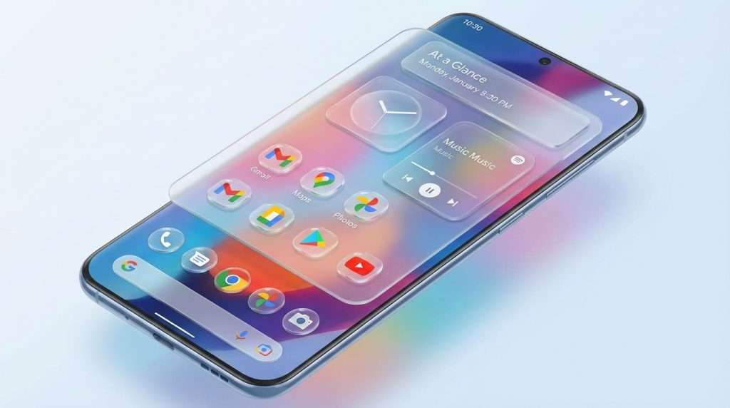
Android 17 Embraces Translucent, Blur-Heavy Visuals
Google is preparing to refresh the look and feel of its Android operating system with the upcoming Android 17 update, codenamed “Cinnamon Bun”. Moving away from the flat, solid colour schemes that have dominated previous versions, Android 17 is set to introduce a frosted glass effect across many core user interface elements. This new design language will feature translucent, blur-heavy backgrounds that add depth and a sense of lightness to the system.
Key Features and Design Changes
According to internal builds reviewed by 9to5Google, the translucent effect will be visible in various system components, including the volume slider and power menu. These elements will no longer be opaque but will instead allow your wallpaper or app icons to subtly show through, creating a more integrated and visually appealing experience. The blurring is further enhanced by Google’s Dynamic Color system, which tints these frosted panels to harmonise with your wallpaper and overall theme, ensuring a cohesive look throughout the OS.
This approach builds on the groundwork laid by Material 3 Expressive, introduced last year, which first brought subtle blur effects to the notification shade and Quick Settings panel. By blurring rather than completely obscuring backgrounds, Android 17 aims to maintain user awareness of the app previously in use, while providing a clear hierarchy that feels more natural to the human eye.
Context and Comparisons
Google’s move towards a translucent UI with blur effects draws parallels with Apple’s Liquid Glass design found in iOS, as well as recent UI updates from Samsung. However, reports suggest that Google’s implementation will be more subtle and refined, focusing on enhancing usability without overwhelming the interface with heavy effects. This evolution reflects a broader trend in smartphone UI design, where transparency and depth are used to create a more immersive and elegant user experience.
What to Expect Next
The first opportunity to see these changes in action will likely come with the Android 17 Developer Preview, expected to launch in early 2026. While the frosted glass effect is confirmed for system menus and overlays, it remains unclear whether Google will extend this design to third-party apps through updated Material Design guidelines. As the release approaches, more details will emerge, offering a clearer picture of how Android 17 will redefine the user interface for millions of Android users worldwide.
For those interested in the evolution of Android’s design language, Android 17 promises a fresh, modern aesthetic that balances style with functionality, signalling a significant shift in how users will interact with their devices in the near future.